The colour of your cabinets can drastically change the kitchens aesthetic, making it one of the most important decisions to make when designing your bespoke kitchen with the Build My Kitchen team. Alongside our stunning collection of styles and designs, we also have a wide selection of colour options to enhance your kitchen and add a touch of personality, whether it be modern, contemporary or traditional. With a dedication to providing each client with a bespoke and completely tailored kitchen design, we are proud to announce that we have 7 new colour additions to add to our collection of Second Nature designs.
To give you some inspiration and kitchen colour ideas, we would like to introduce you to our new range of colours available when creating a kitchen design in Milton Keynes.
7 New Colours To Inspire Your Kitchen Colour Ideas
Our Second Nature range is extremely popular with our clients due to its high quality and exquisite design. When chosing from our wide selection of Second Nature designs, you already have a wide choice of colour options, ranging from Deep Oak to Burnt Ash, and much more! However, as it seems that many clients are looking to make a bold statement in their kitchen, Second Nature has expanded its cabinet colour range to include deeper hues, such as blues, reds and greens. With the expanding colour range available, finding a beautiful colour palette that complements your kitchen design couldn’t be easier.
Pimento
Red has recently become a popular colour to incorporate into the kitchen, with many homeowners opting for ashy reds and burnt tones. While striking red backsplashes have been popular in the past, a more toned down red that beautifully complements warm neutrals, lighter shades, and greys is being favoured by many. For this reason, Second Nature has designed a statement red with a more subtle tone, which looks stunning when paired with gold handles and a black worktop.
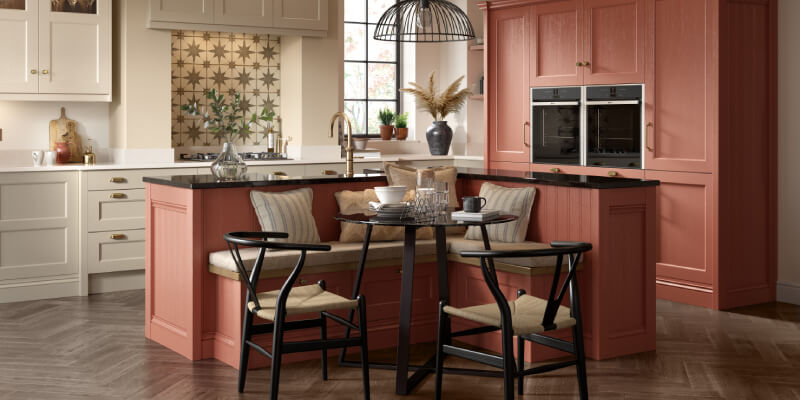
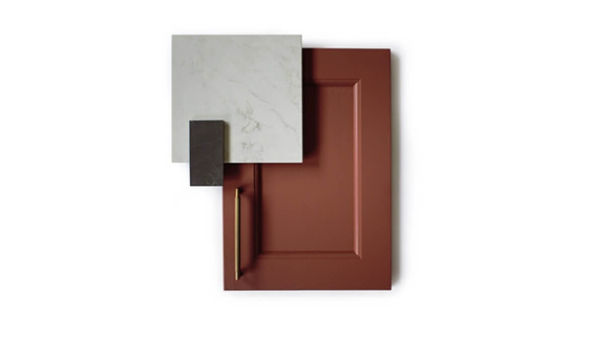
Georgian Red
As red is a popular colour at the moment, Second Nature has introduced another muted red inspired by brickwork of rural towns and villages. The red tone offers an earthy and elegant shade that looks sophisticated and modern with a hint of traditional flair. This colour looks stunning in most settings, but particularly for those looking to create a warm and soothing kitchen ambience. Much like the Pimento red, the Georgian Red looks elegant when paired with gold features and marble finishes.
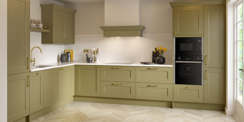
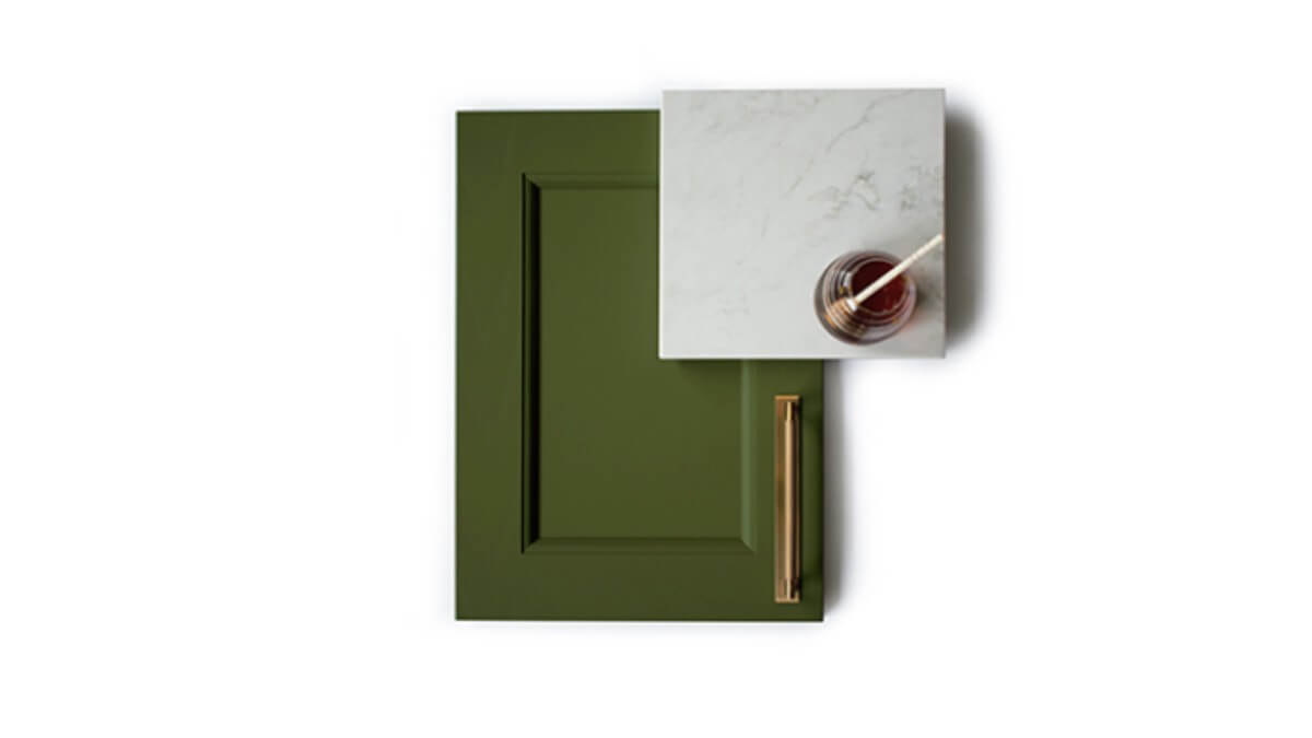
Olive
A traditional colour particularly popular in the 60s and 70s is green, which has seen a reemergence over the past year or so when it comes to kitchen designs. However, the green tone has been modernised with a more subtle shade that looks stunning with both traditional and modern style kitchens. The colour offers a timeless finish to your space, especially when paired with modern finishes such as silver or gold handles and crisp white worktops and walls.
Bay Green
If you are looking to go brave with a quirky and striking kitchen colour, then you are going to fall in love with the Bay Green shade. Unlike the Olive green, the Bay Green offers a deeper and richer colour, providing you with an earthy and natural tone that looks utterly stunning when integrated into modern settings. This colour creates a relaxing and homely aesthetic, particularly when paired with darker colours on the worktops. However, we highly recommend white and marble worktops to complement the lighter side of the green shade.
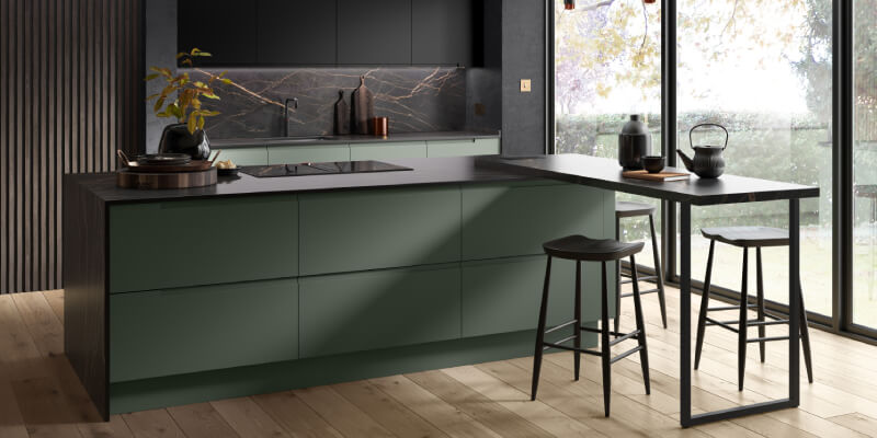
Regents Green
To bring a new perspective of darker hues into the mix, the Regents Green colour offers a darker and relaxing ambience perfect for pairing with darker features. The Regents Green tone looks stunning when incorporated into a contemporary design, offering a beautifully seamless finish that adds to the soothing and calming effects that this colour creates. The green is rich and graceful, creating a sophisticated and elegant space. We recommend incorporating this colour into a larger kitchen with lots of natural light to contrast the darker hues.
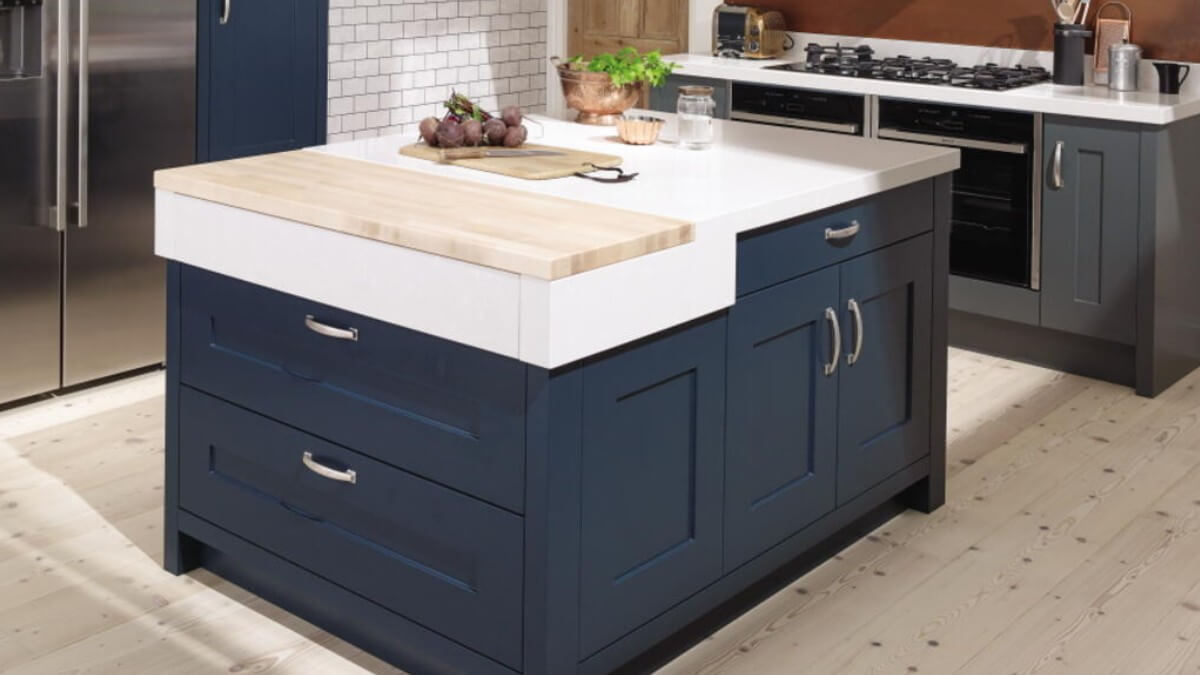
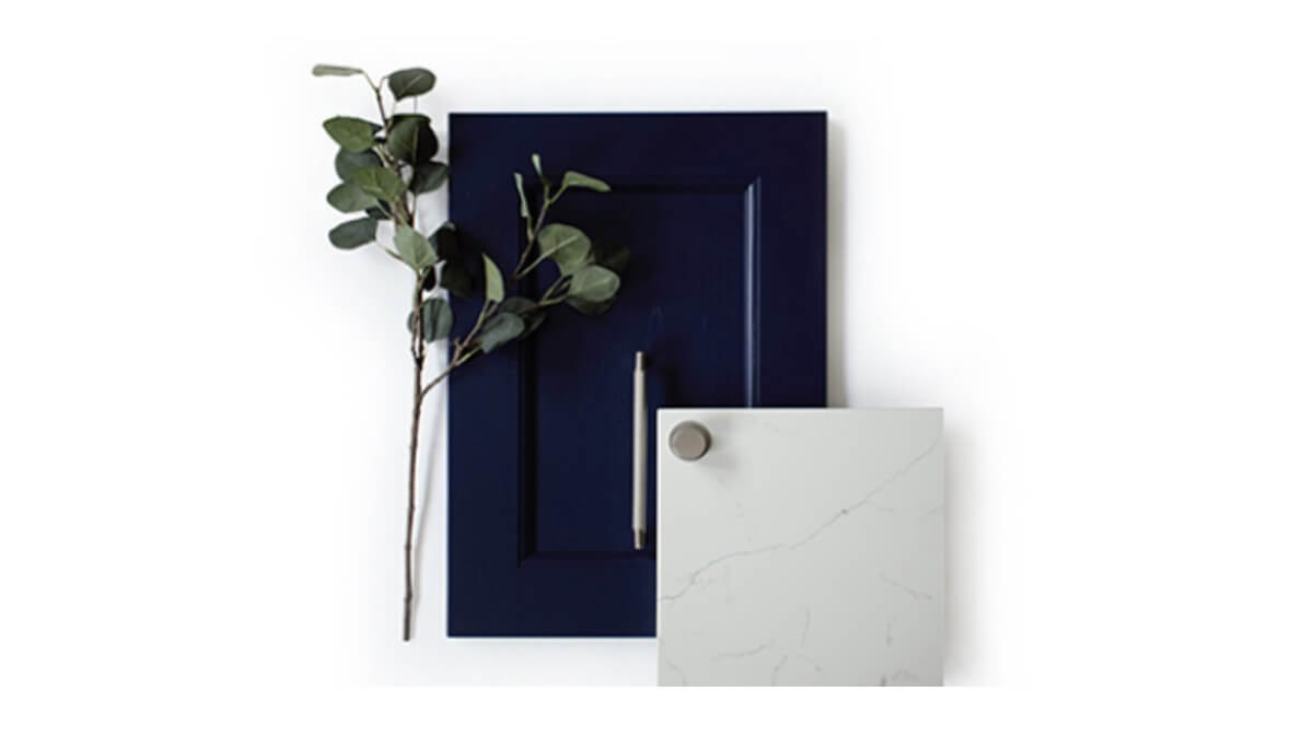
Inkwell
As well as green and red, another popular colour to enter kitchen designs are rich blues. Instead of incorporating light blues, which are still a popular choice, the Inkwell shade gives a darker and deeper alternative that creates a mellow ambience with a striking aesthetic. We recommend that the inkwell blue is paired with lighter features and walls to ensure the blue pigment takes centre stage and highlights the fine lines in a marble worktop.
Ives Blue
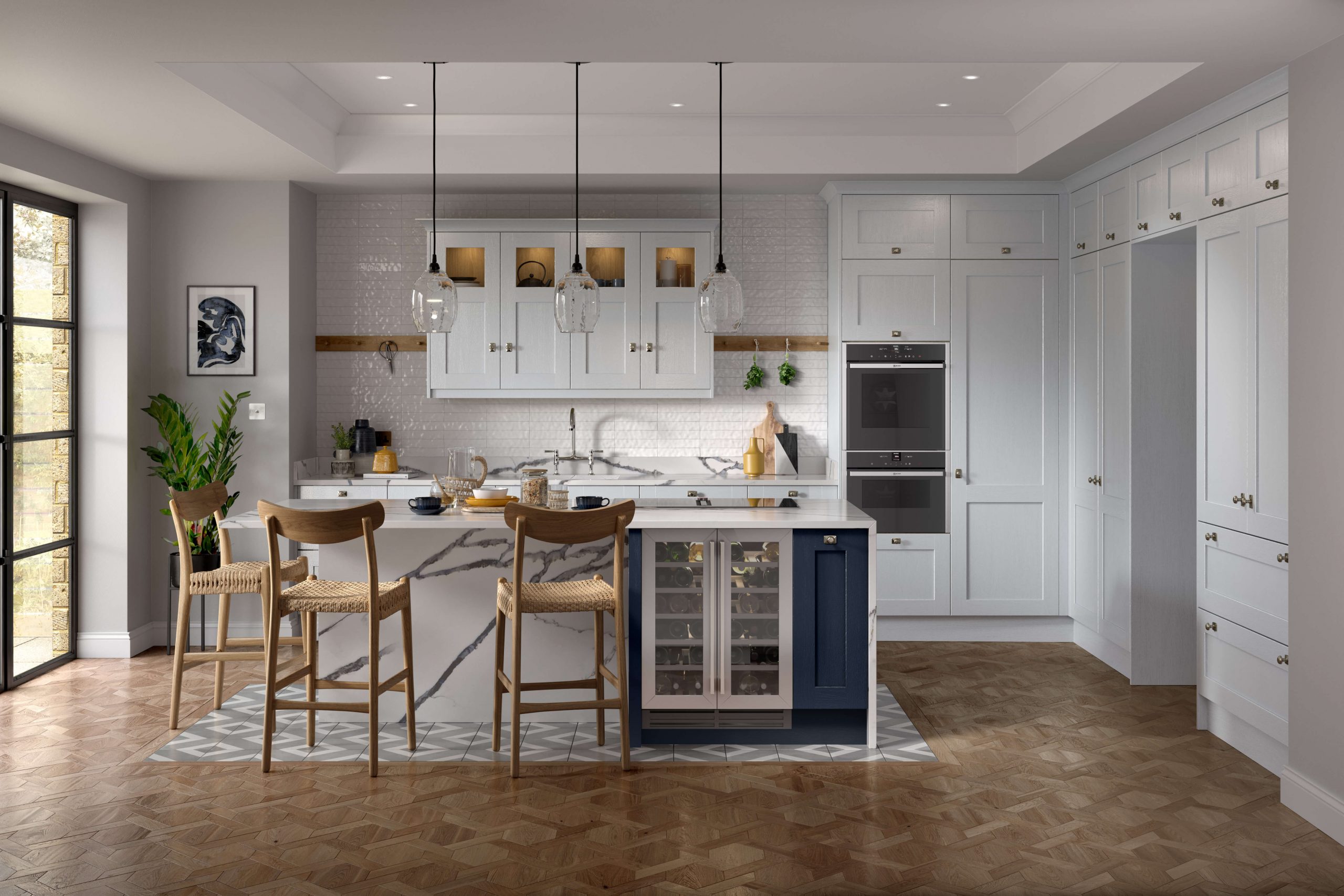
As mentioned above, lighter blues are also extremely popular, which can be seen in one of our recent projects using a chalk blue on a Second Nature Ellerton design. Second Nature has created another, slightly darker blue to the chalk blue, standing out when paired with white or grey cabinets and worktops. The Ives Blue offers a natural tone, which looks stunning when placed against oak features. The lighter shade of the Ives Blue makes it ideal for those that wish to create intricate statement pieces, such as the patterned floor featured in the image below.
Designing Your Kitchen Cabinets
The colour of your cabinets can bring together your kitchen design, creating a bespoke and tailored finish that matches your aesthetic. When it comes to choosing these colours, it is always important to make sure that you pick tones and shades that beautifully complement each other. The Build My Kitchen team can help you to pick from our wide selection of colour options when designing your bespoke kitchen in Milton Keynes, so why not give them a call?